Paste a raw screenshot into a doc, a changelog, or a landing page and it reads like an afterthought: a white rectangle with hard edges, dissolving into whatever sits behind it. Apply four mechanical edits — a backdrop, generous padding, rounded corners with a soft shadow, and a one-line caption — and the same pixels suddenly read as intentional. The gap between the two is not design talent. It is a recipe, and it takes about thirty seconds once you know it.
This walkthrough covers the recipe with two free browser tools. The free screenshot beautifier takes a dropped or pasted screenshot and returns a finished PNG: a gradient or solid background, padding, rounded corners, a shadow, an optional browser frame, and a caption — with a watermark-free export. The device frame generator handles the moments when a screenshot should live inside an iPhone, Android, MacBook, or browser frame, with its own shadows and gradient backdrops.
Try Screenshot Beautifier — free, no sign-up.
Along the way: what each edit actually does, a before-and-after teardown, where the paid tools in this niche make their money, and a checklist to run before you export.
The anatomy of a screenshot that looks designed
Every screenshot you have ever admired on a polished landing page decomposes into the same five edits, and none of them are subjective:
| Edit | What it does | Rule of thumb |
|---|---|---|
| Backdrop (gradient or solid) | Separates the image from whatever sits behind it | One hue family per document |
| Padding | Gives the content air | When in doubt, double it |
| Rounded corners + shadow | Makes the image read as an object, not a cut-out | Subtle radius, diffuse shadow |
| Frame | Signals context: web page or app | Match the frame to where the capture came from |
| Caption | Explains the image before the reader parses pixels | One line, outcome-first |
Backdrop. This is the single biggest lever, which is why people hunting for a screenshot background generator are really hunting for this one feature. Most screenshots have white or near-white edges, so pasting them onto a white page erases the boundary entirely. A gradient or solid backdrop in a darker, saturated hue restores the boundary and sets a mood at once. Consistency is what separates "colorful" from "designed": keep one hue family across every screenshot in the document — violet-to-indigo for the whole onboarding guide, not violet on page one and teal on page two.
Padding. Cramped padding is the loudest amateur tell. The backdrop exists to frame the content, so let it; if the border between backdrop and screenshot looks like a thin bezel, the composition reads as pinched rather than deliberate.
Corners and shadow. A hard-edged rectangle reads as something cut out with scissors. The same rectangle with a modest corner radius and a soft shadow reads as an object resting on the page. Both effects should be mild — the goal is depth, not drama.
Frame. A browser frame tells the reader "web page" before they parse a single pixel of the UI. A device frame says "mobile app." Picking the wrong one creates a low-level dissonance even for readers who never articulate what is bothering them.
Caption. One line that names the outcome shown. Readers scan captions before they study pixels, so a screenshot with gradient background and a crisp caption explains itself; without one, the reader has to reverse-engineer your point from the interface.
Before and after: the same image, twice
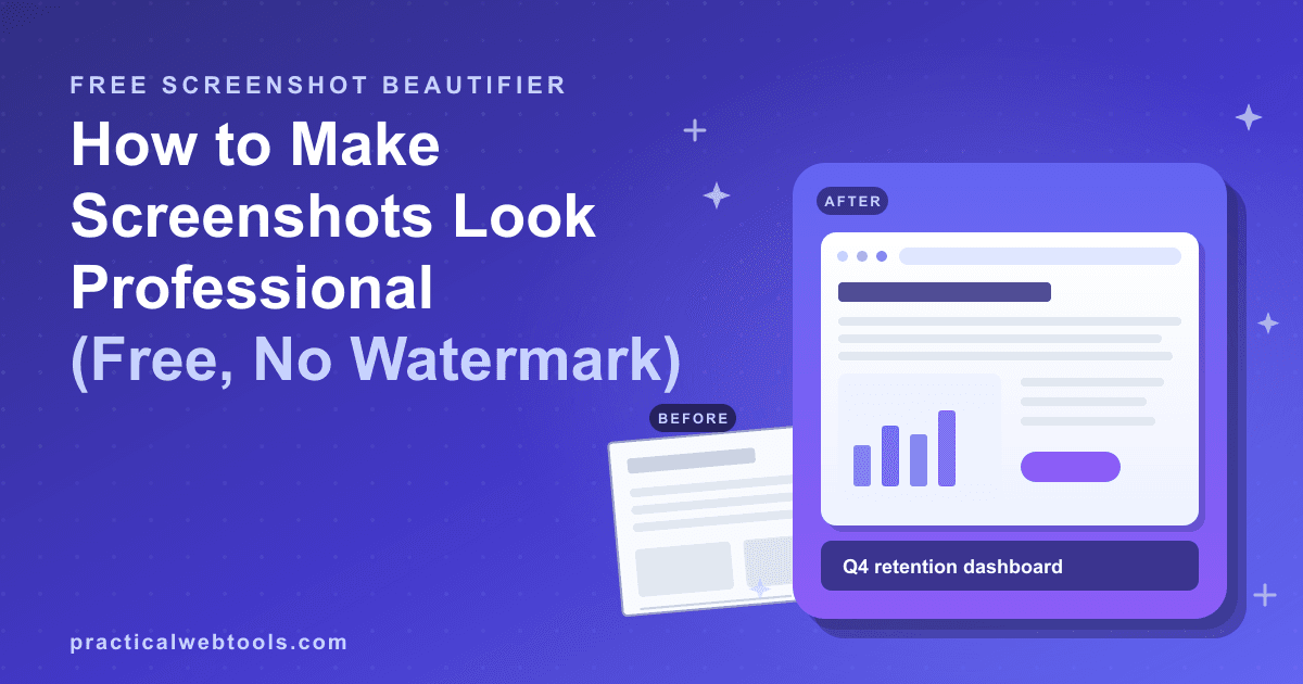
A concrete example. Start with a stock capture of a settings page: white background, system font, a toolbar, a table of toggles. Pasted raw into a product doc, three things go wrong at once. The white background merges with the page behind it, so the eye cannot find where the screenshot ends. The hard corners make the image look accidental, like something pasted in a hurry. And nothing tells the reader what they are looking at, so they skim past it.
Now run the same capture through the same pipeline a beautifier applies. The changes are small and mechanical: a violet-to-indigo gradient backdrop behind the image, enough padding that the backdrop forms a visible border on all four sides, a modest corner radius with a soft shadow lifting the image off the page, and a caption bar underneath reading "Team settings — invites now self-serve." Nothing inside the screenshot changed. What changed is that the image now has a boundary, depth, and a point — which is the entire difference between a pasted capture and a designed one.
The lesson from the before/after pair: you do not need to touch the content. People open an image editor and start futzing with the screenshot itself; the professionals leave the pixels alone and change everything around them.
Step-by-step: from raw paste to finished PNG
- Capture consistently. Take screenshots at the same window size and zoom level across a set. The beautifier frames whatever you give it; it cannot reconcile one image captured at 100 percent and the next at 130.
- Drop or paste. Both land the same way — drag the file in, or paste straight from the clipboard into the beautifier.
- Pick the backdrop. Gradient for docs and landing pages, where a little depth helps; solid for layouts that already carry strong color. Stick to your one hue family.
- Set the padding. Err generous. If it feels like too much, it is probably right.
- Round the corners and add the shadow. Small radius, soft spread. You want the screenshot to sit on the backdrop, not float cartoonishly above it.
- Add the browser frame if the content is a web page. Three dots and an address bar do an enormous amount of contextual work for zero effort.
- Write the caption. Outcome-first, not feature-first: "Search now understands unit ranges" beats "New search UI."
- Export the PNG. The export is watermark-free — you get the finished image and nothing else.
Run the sequence twice and it compresses to well under a minute per screenshot. For a ten-image changelog, that is the difference between a section that looks shipped and one that looks pasted.
When a device frame says more than a browser frame
Sometimes the subject is not the screen but the context: a mobile flow, a cross-device feature, a marketing shot. That is what the device frame generator is for — it wraps a screenshot in an iPhone, Android, MacBook, or browser frame, with a shadow and gradient backdrop included, so the composition work is already done.
The rule of thumb: use a device frame when the hardware is part of the message. A release-notes entry about new mobile navigation lands harder inside a phone, because the reader instantly understands where the feature lives. A desktop-only power feature wants the browser frame, or no frame at all once the beautifier's backdrop and padding are doing the work. Marketing pages lean heavily on device frames because they show the product in the reader's hand rather than in the developer's window — and because a phone silhouette at thumbnail size survives compression far better than dense UI does.
One warning from the same principle: do not mix frame metaphors within a set. A phone frame next to a bare screenshot next to a browser frame, all in one section, reads as three tools on three days. Pick one metaphor per page.
Why the paid beautifiers charge for this
Search for a pretty screenshot maker and you will find the category has settled into a familiar pricing shape. Xnapper is a paid product. Picyard and BrandBird run freemium models with watermark-gated exports as of late 2026 — the free tier happily renders your image, then stamps a logo across it until you subscribe. The work being gated is deterministic image composition: place image on backdrop, add padding, round corners, composite the frame, draw the caption. There is no server-side magic in any of it, which is exactly why it can run entirely in your browser.
That is the case for treating the screenshot beautifier as a free Xnapper alternative: it performs the same composition client-side — no upload, no sign-up — nothing you type or drop leaves your device — and the PNG export carries no watermark. For the layer the recipe does not cover, a small detour helps: arrows, callouts, and simple custom icons drawn on top of a capture before beautifying it. The free online vector editor workflow covers exactly that, in the browser, without Illustrator.
The pre-export checklist
- One hue family. Every screenshot in the document shares a backdrop family. Variety belongs in the content, not in the frames.
- Matched geometry. Identical padding and corner radius across the set. Mismatched frames read as sloppiness even when readers cannot name why.
- Caption hierarchy. Same style, same length class, same capitalization rule, every time.
- Frame matches platform. Phone captures in phone frames, web pages in browser frames, bare-but-padded when the content speaks for itself.
- Thumbnail test. View the result at the size readers will actually see it. If the caption is unreadable at 320 pixels wide, shorten the caption, not the screenshot.
- Format. PNG for anything with text. JPEG artifacts collect around UI lettering and never leave.
Frequently Asked Questions
Is the exported PNG really watermark-free?
Yes. The beautifier's PNG export carries no badge, logo, or overlay — the free output is the full output. That is the main practical difference from freemium beautifiers that render your composition and then stamp it until you pay.
Is this a workable Xnapper alternative?
For the core job — backdrop, padding, rounded corners, shadow, browser frame, caption, PNG export — yes. Xnapper is a paid product; this covers the same edit list free, in the browser, with nothing to install.
Does my screenshot get uploaded anywhere?
No. The beautifier runs fully in the browser: no upload, no sign-up — nothing you type or drop leaves your device. A screenshot often contains internal URLs, names, and data, so that is the right default.
When should I use the device frame generator instead?
When the hardware is part of the message: mobile flows, app-store-style marketing shots, cross-device features. For desktop UI, the browser frame — or just backdrop and padding — usually reads cleaner.
What makes a good caption?
One line, outcome-first, sentence case. Name what the reader gets from the screen shown — "Search now understands unit ranges" — rather than labeling the interface element they are looking at.